Actually I like the Internet Archive very much. I have uploaded some digital artefacts there and regularly make use of the Wayback Machine. But I think it's a pity that so little effort is put into the design of their website.
Homepage
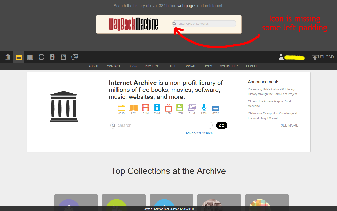
Wayback Machine (archive.org/web)
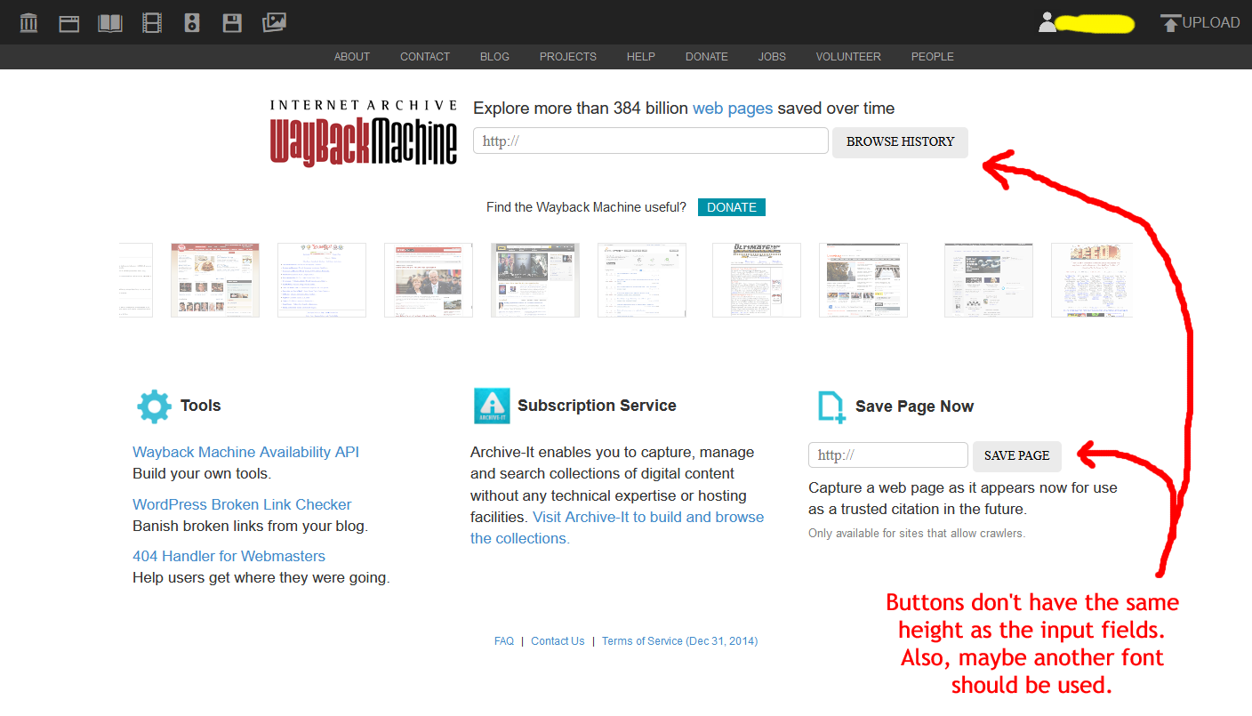
Wayback Machine (web.archive.org)
Yes, there are two versions. Don't know why.
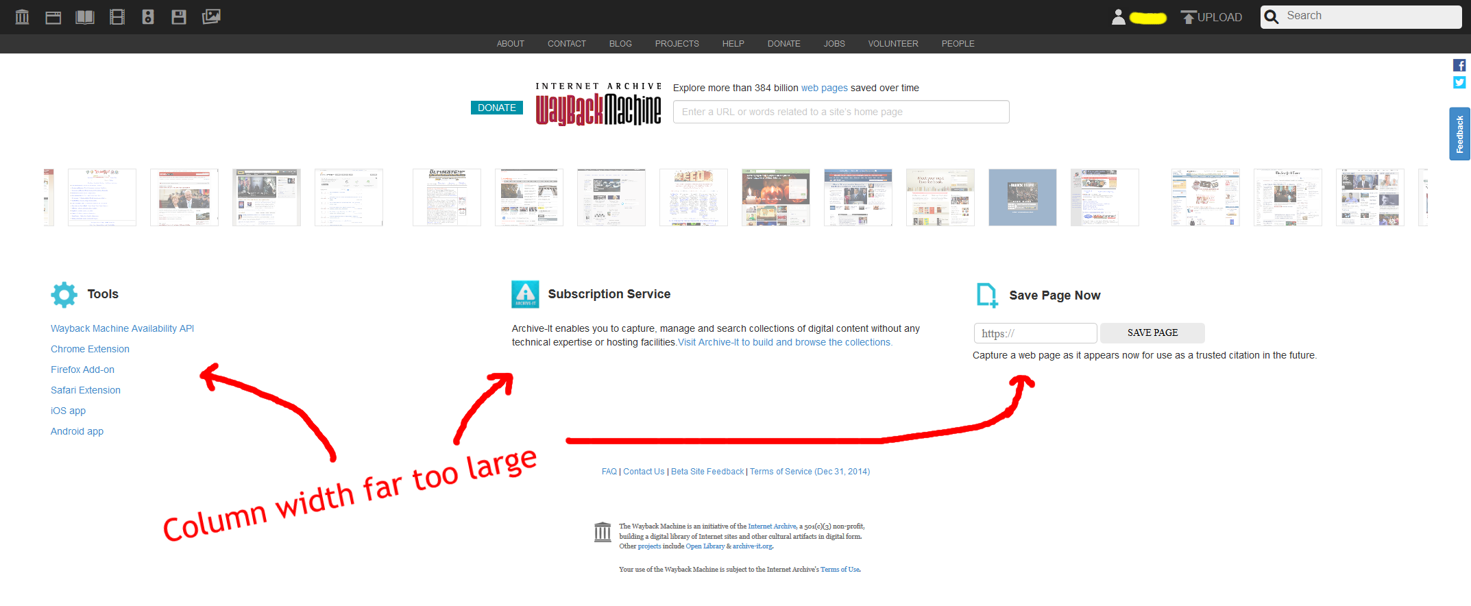
Wayback Machine: Save page now

Wayback Machine: Saving page

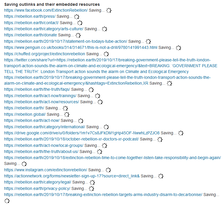
Wayback Machine: Saving outlinks
Infinite loading animation. Doesn't work.
Wayback Machine: Calendar
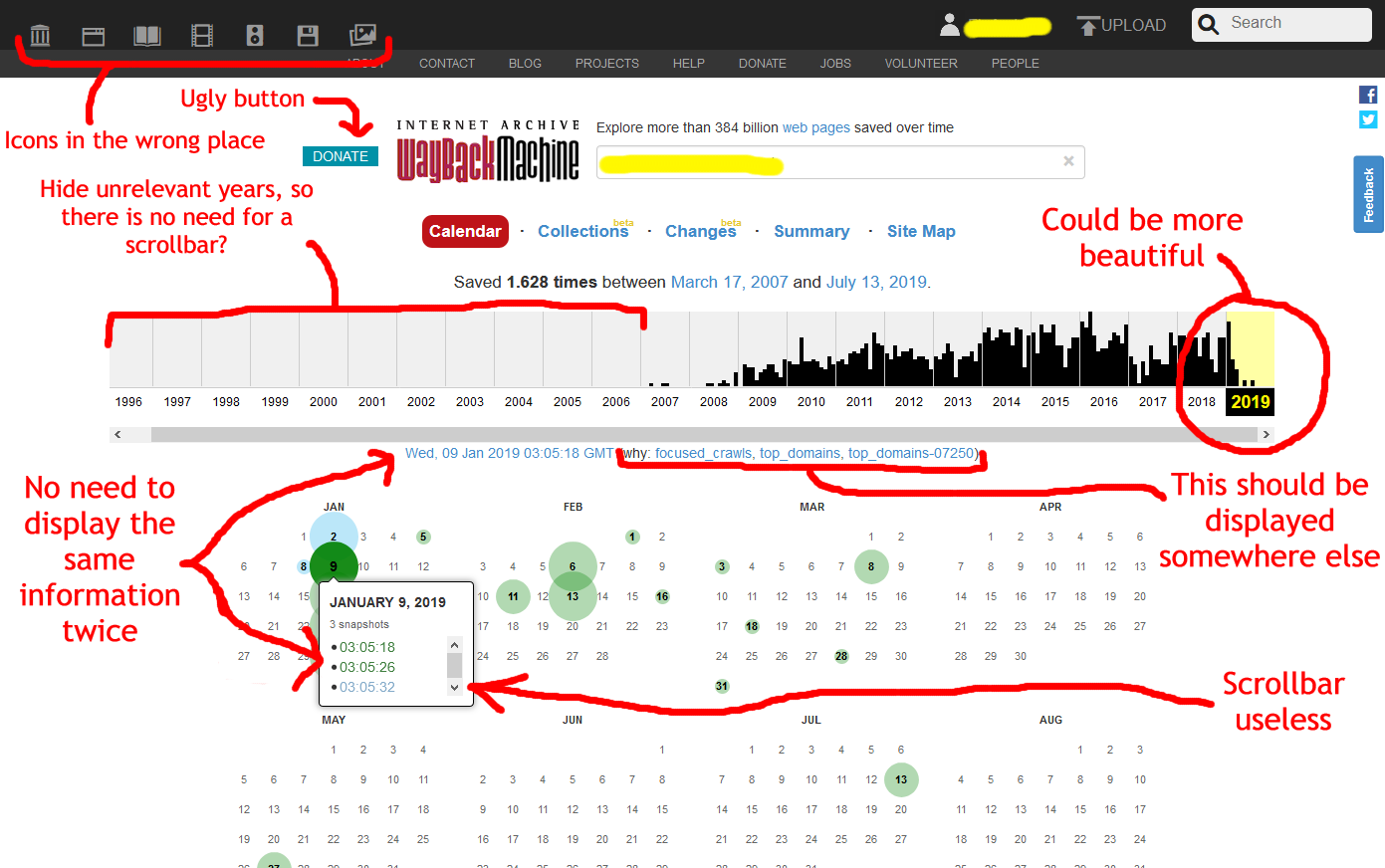
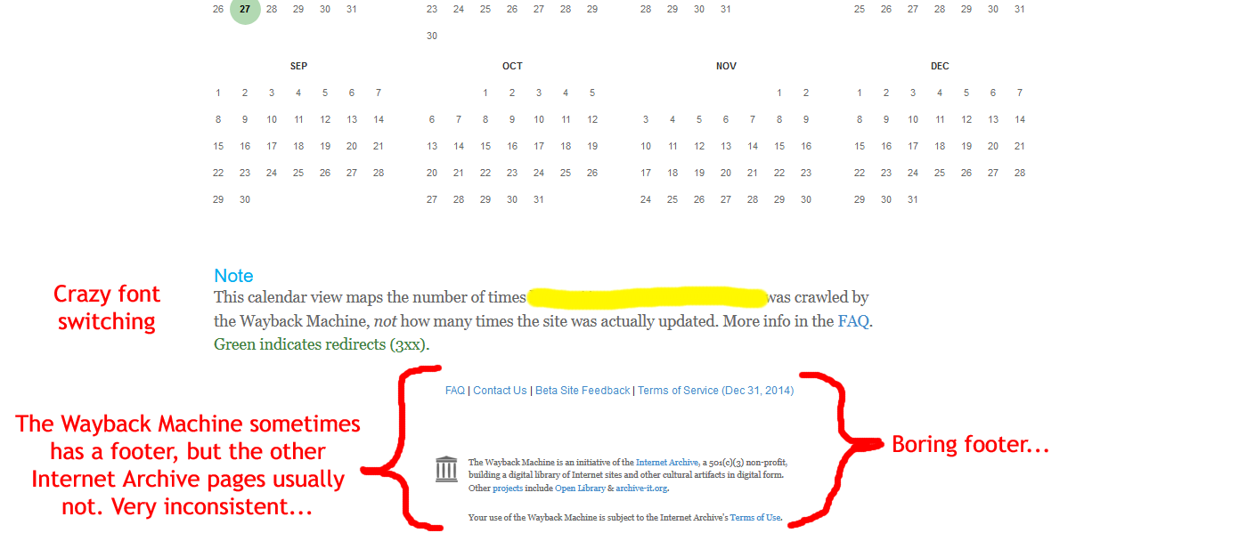
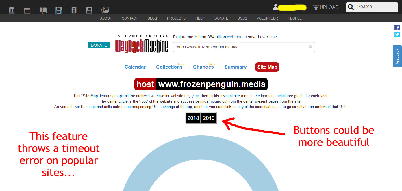
Wayback Machine: Site map
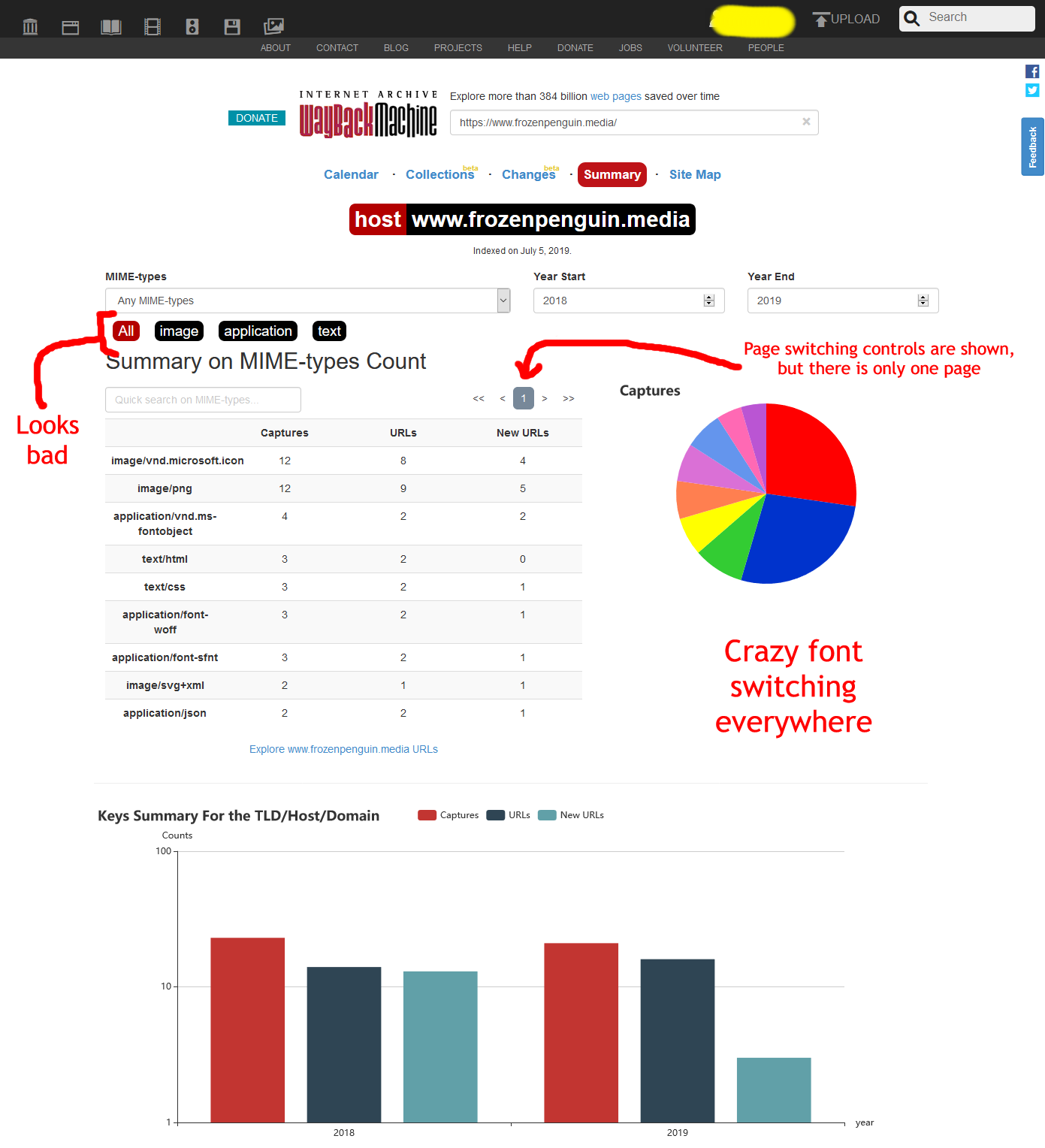
Wayback Machine: Summary
Wayback Machine: View capture

Wayback Machine: Not archived
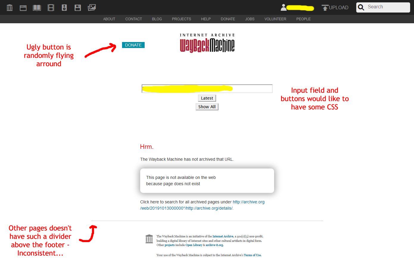
Wayback Machine: Error

Uploading-attempt while not logged in

Account
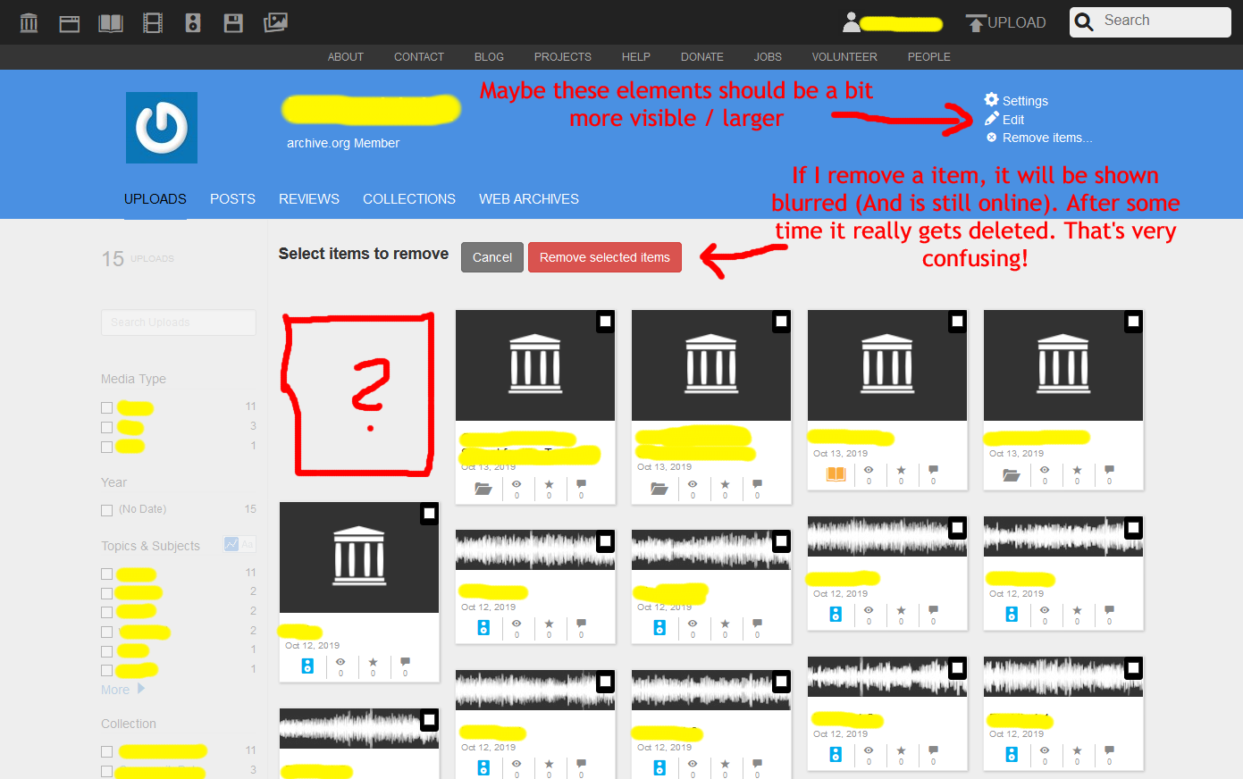
Account: Posts

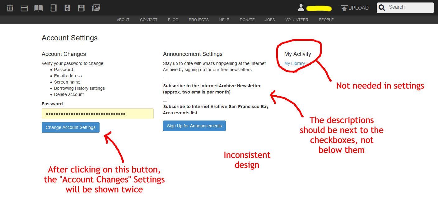
Account: Web archives
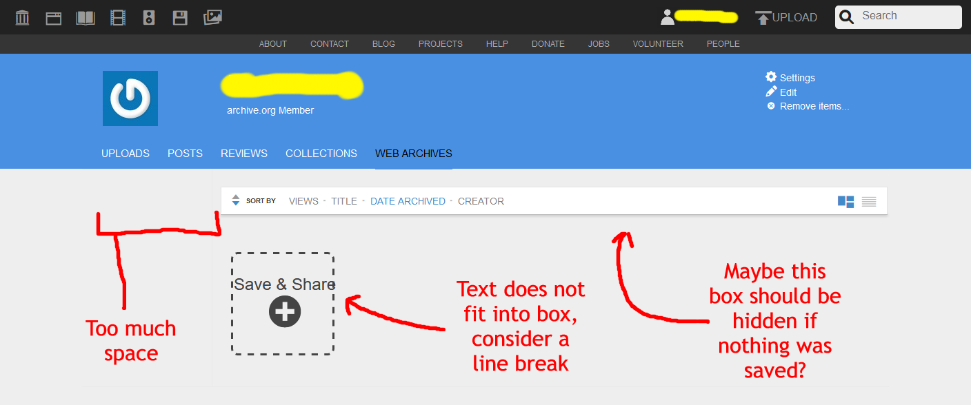
Account: Settings
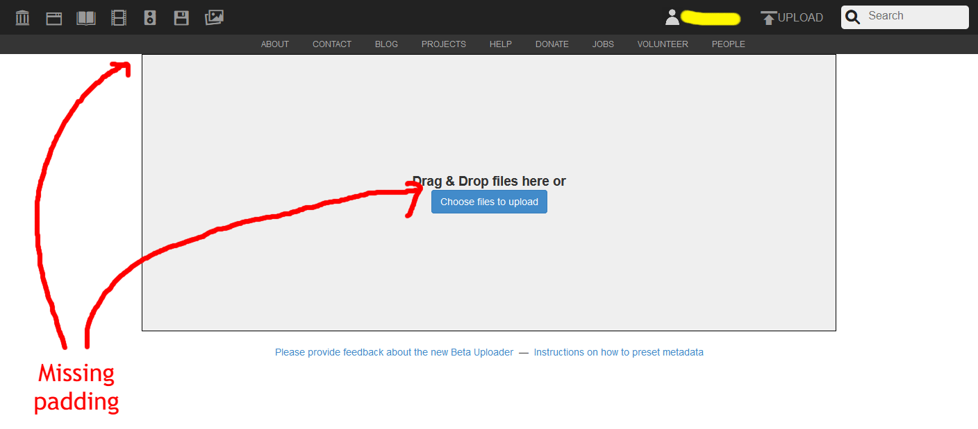
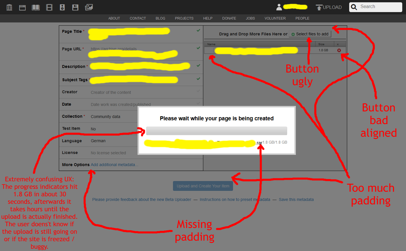
Upload item
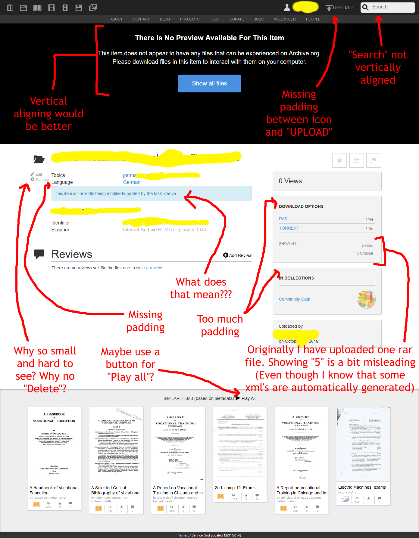
Item
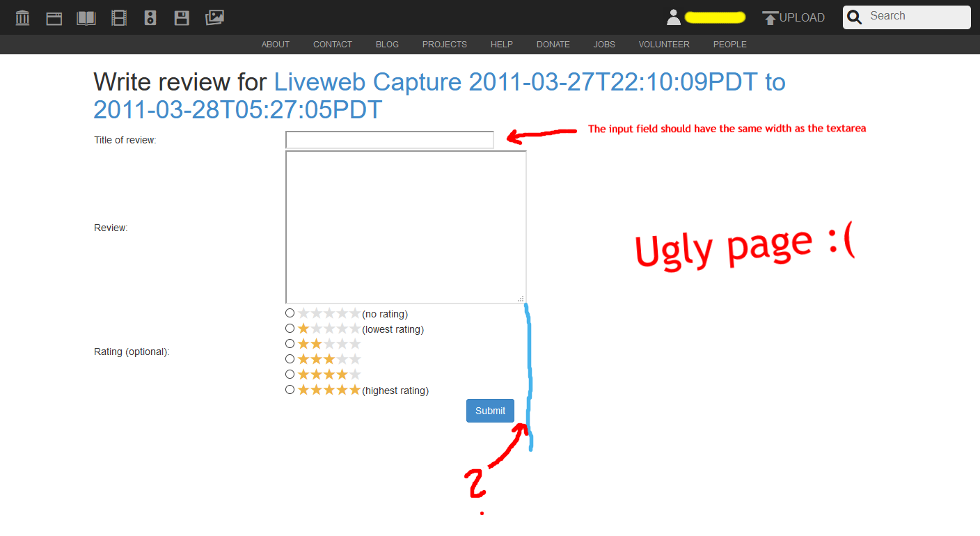
Item: Write review
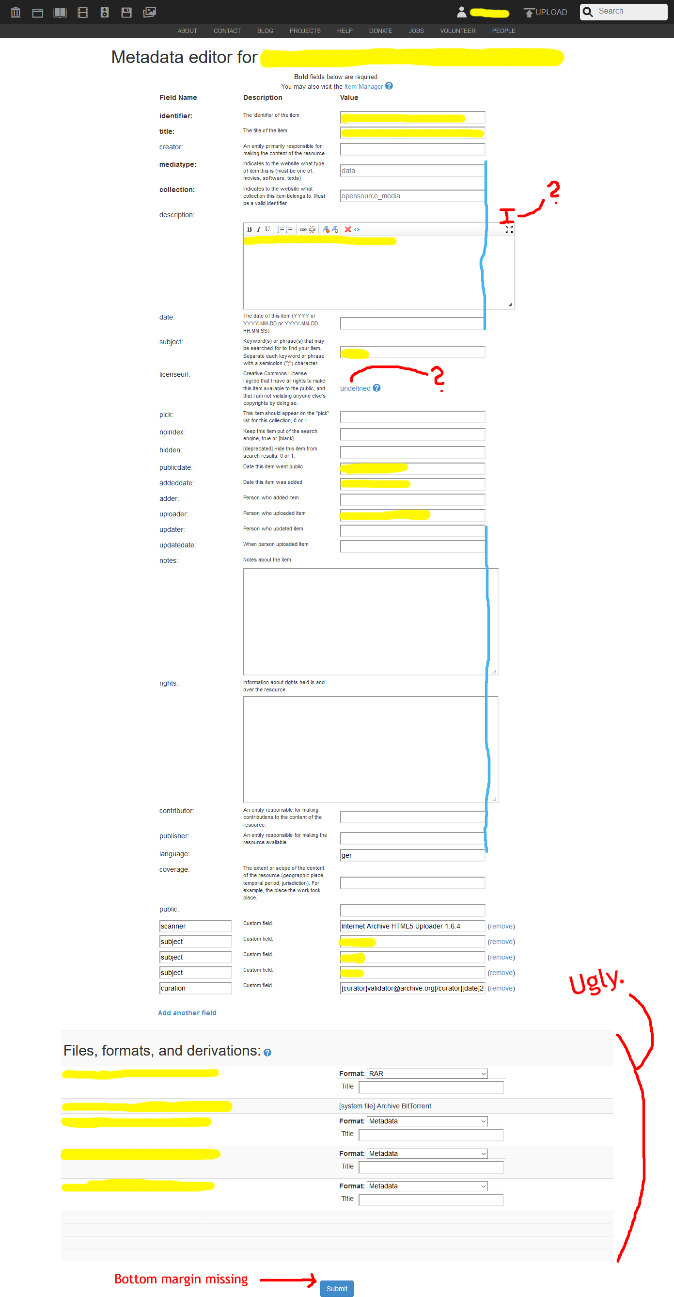
Item: Metadata editor
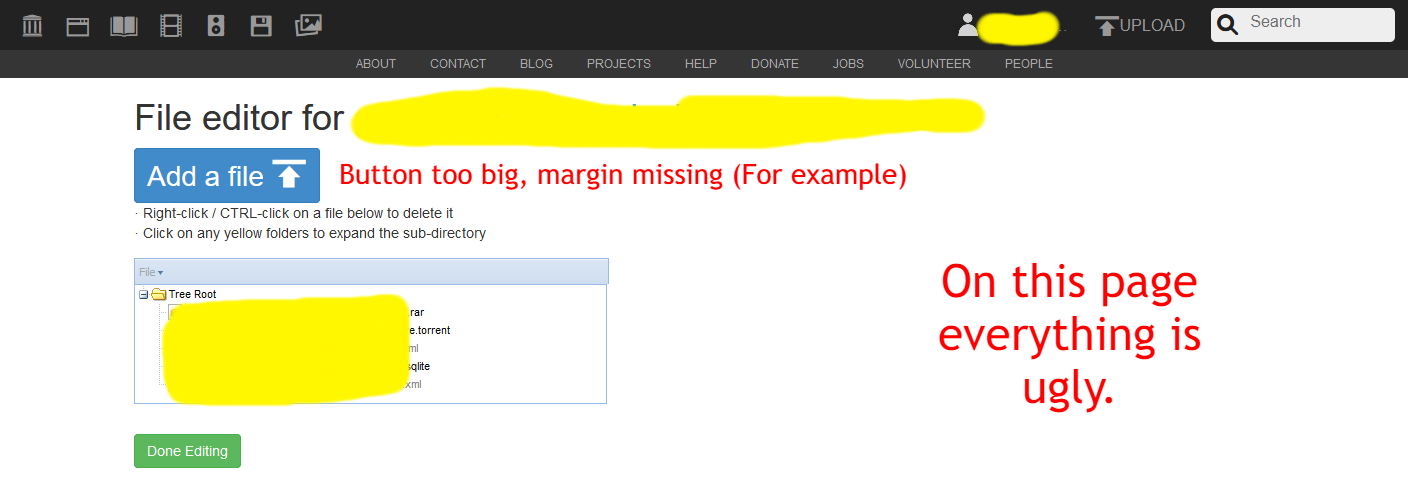
Item: File editor
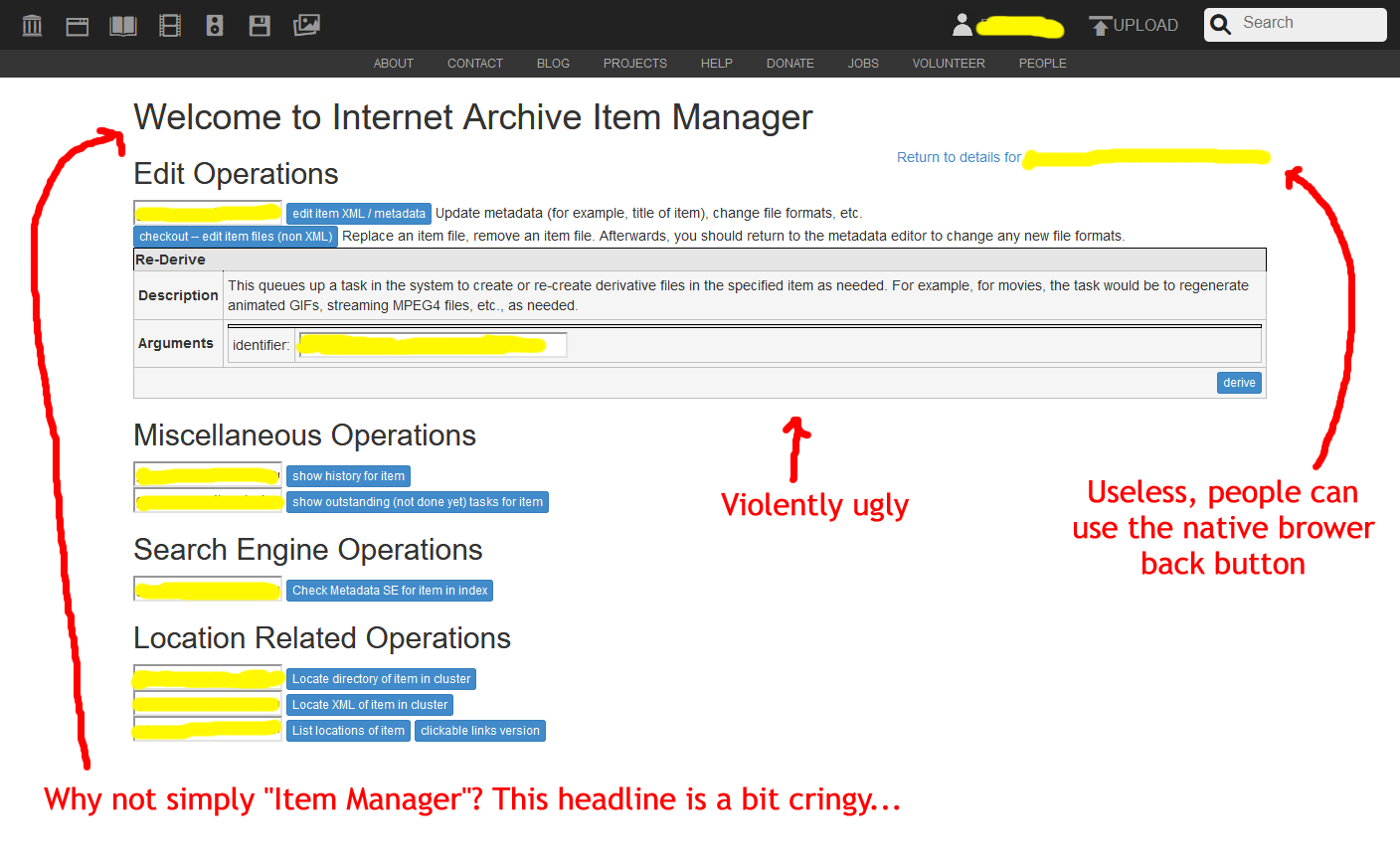
Item: Manager
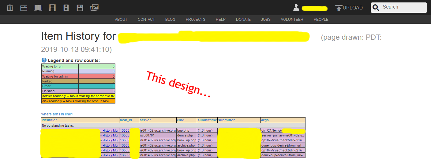
Item: History
Item: Outstanding tasks

Item: Deriver queue

Item: Metadata index check

Item: List locations

Item: Playback failed

Item: Not available

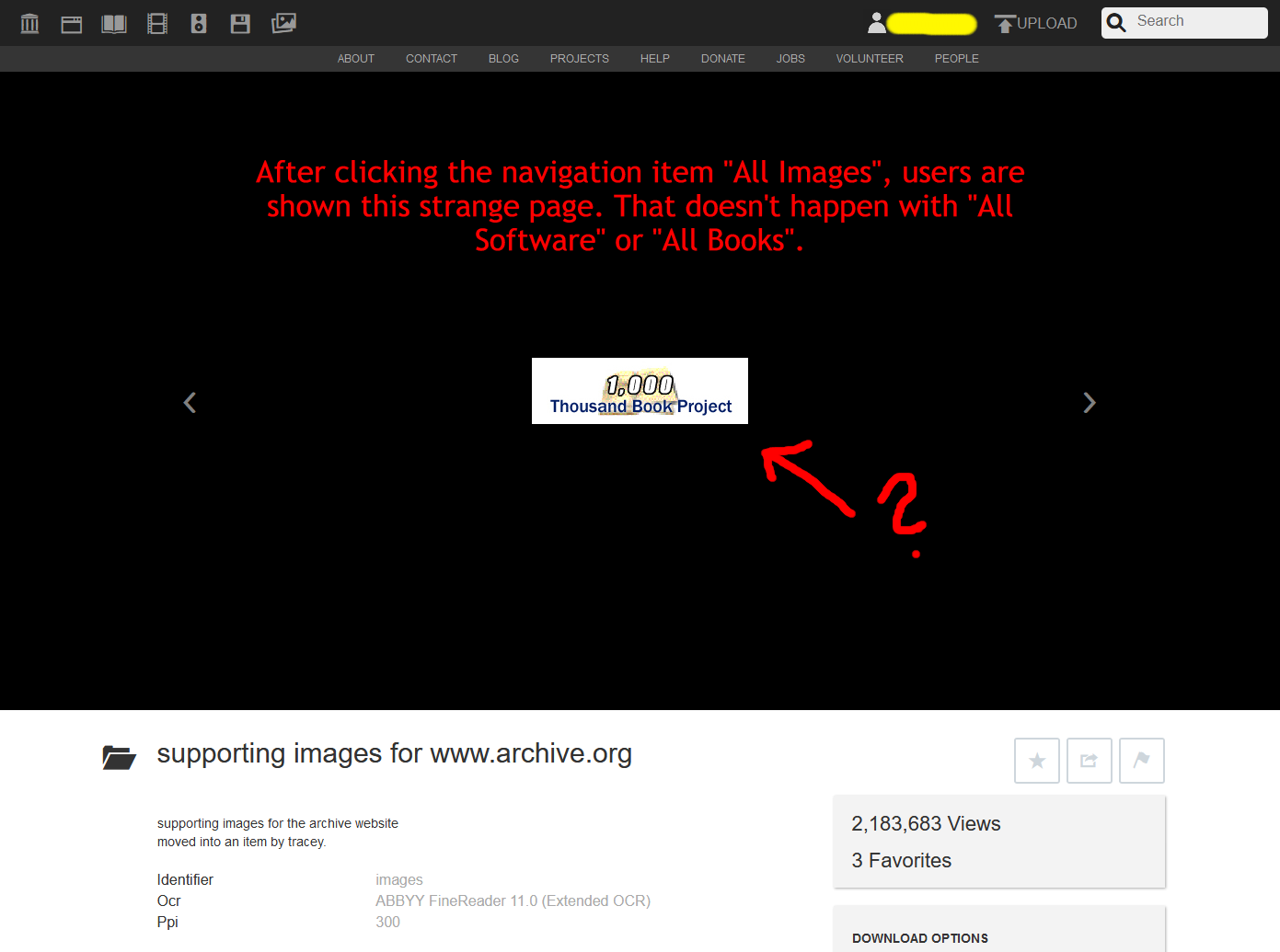
All images
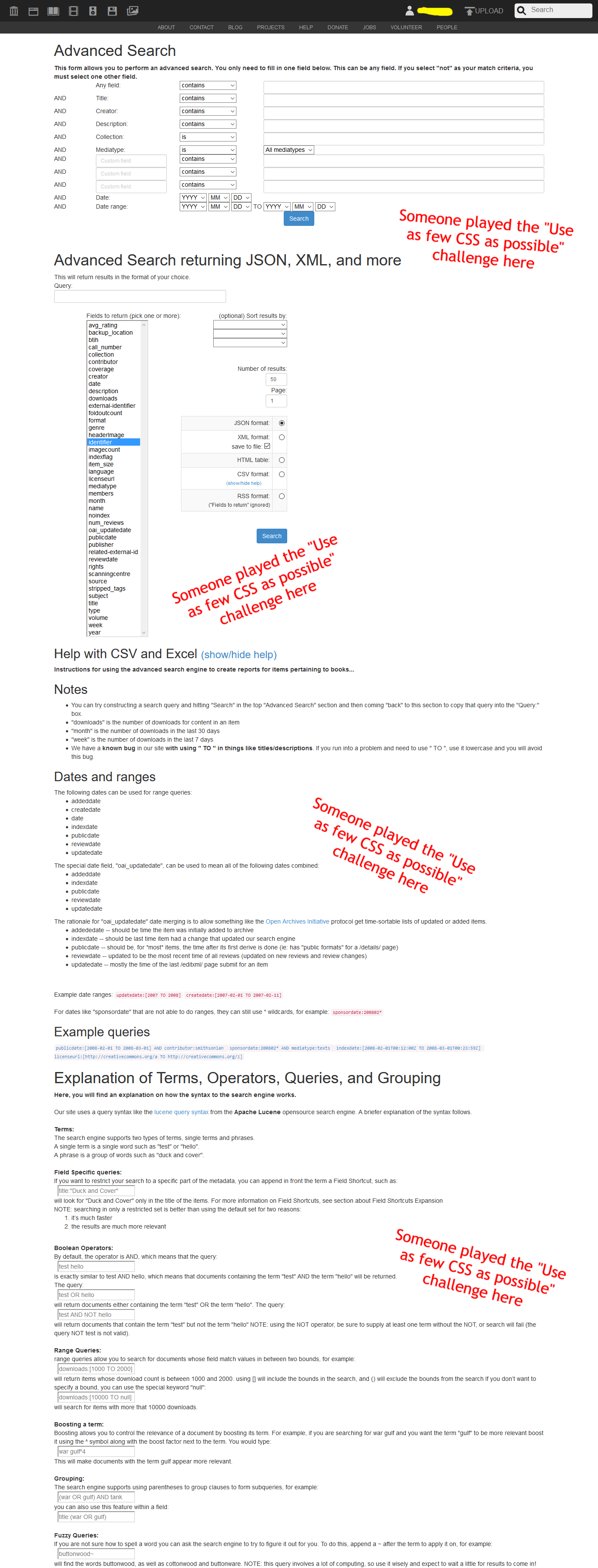
Advanced search
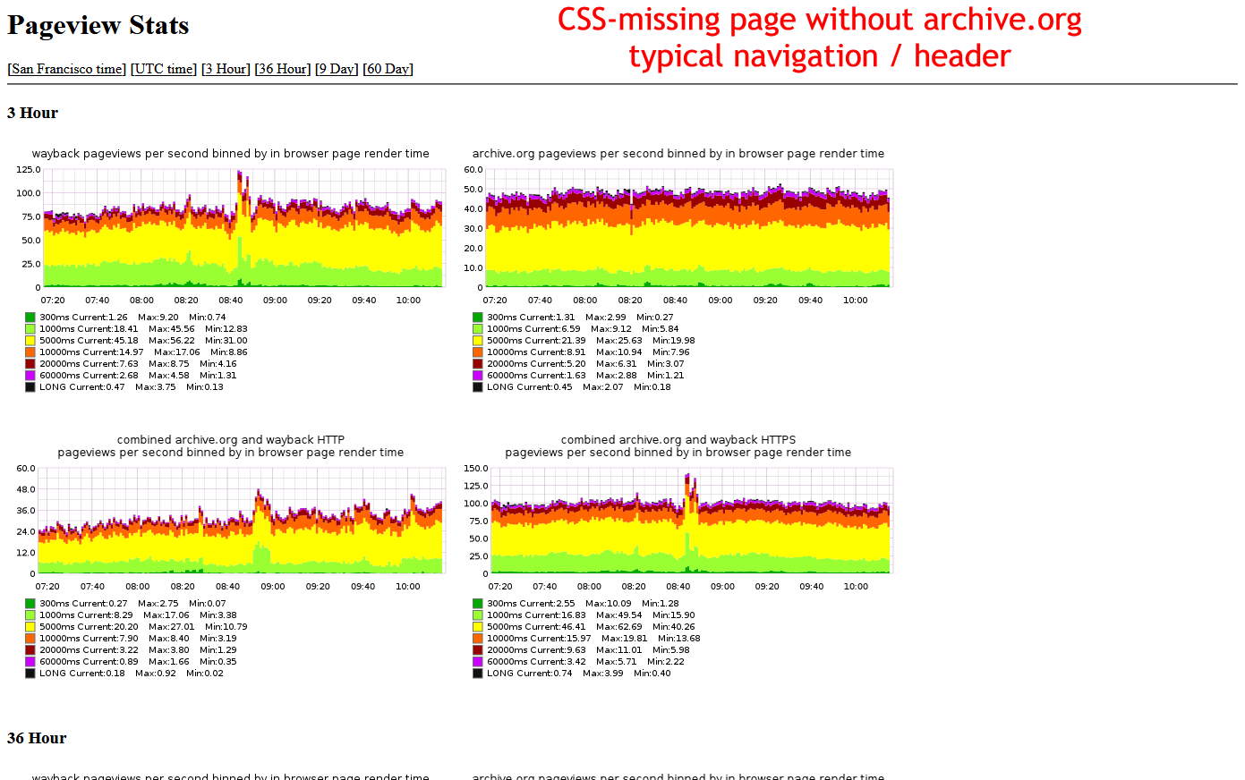
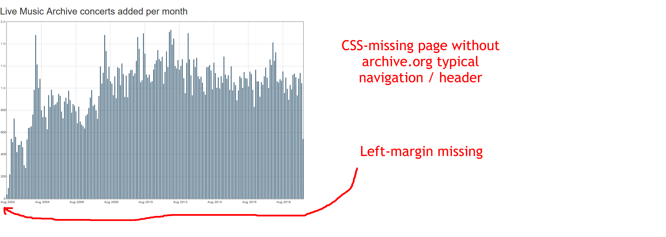
Server statistics: Pageviews
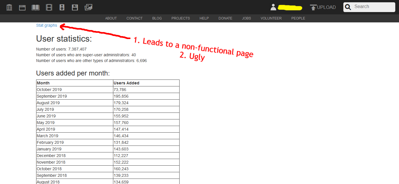
Archive statistics

Archive statistics: Audio statistics
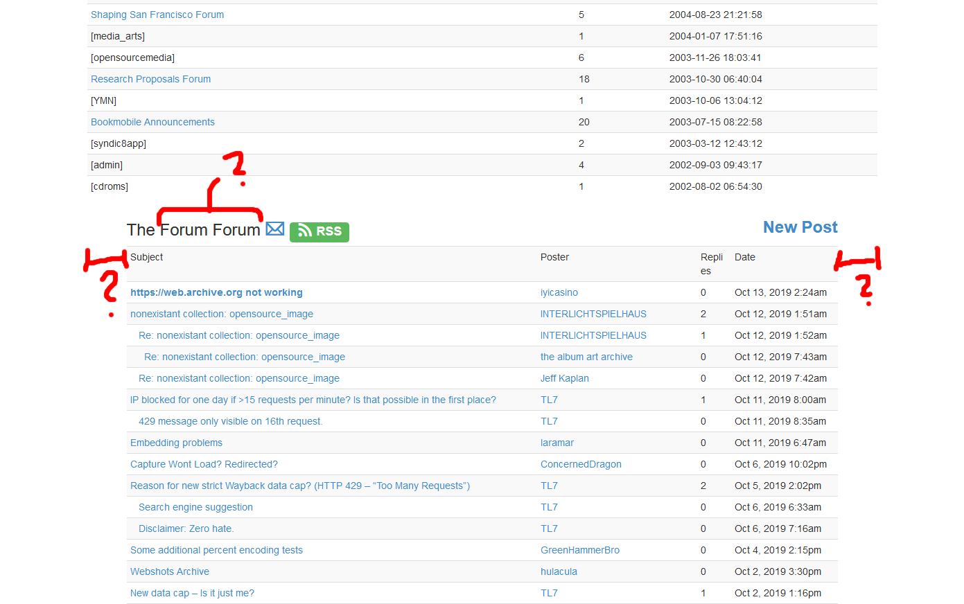
Forum
By the way: It's quite hard to find the forum because it's not available in the navigation.

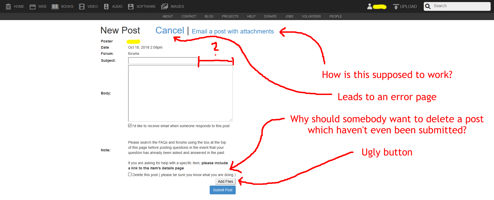
Forum: New post
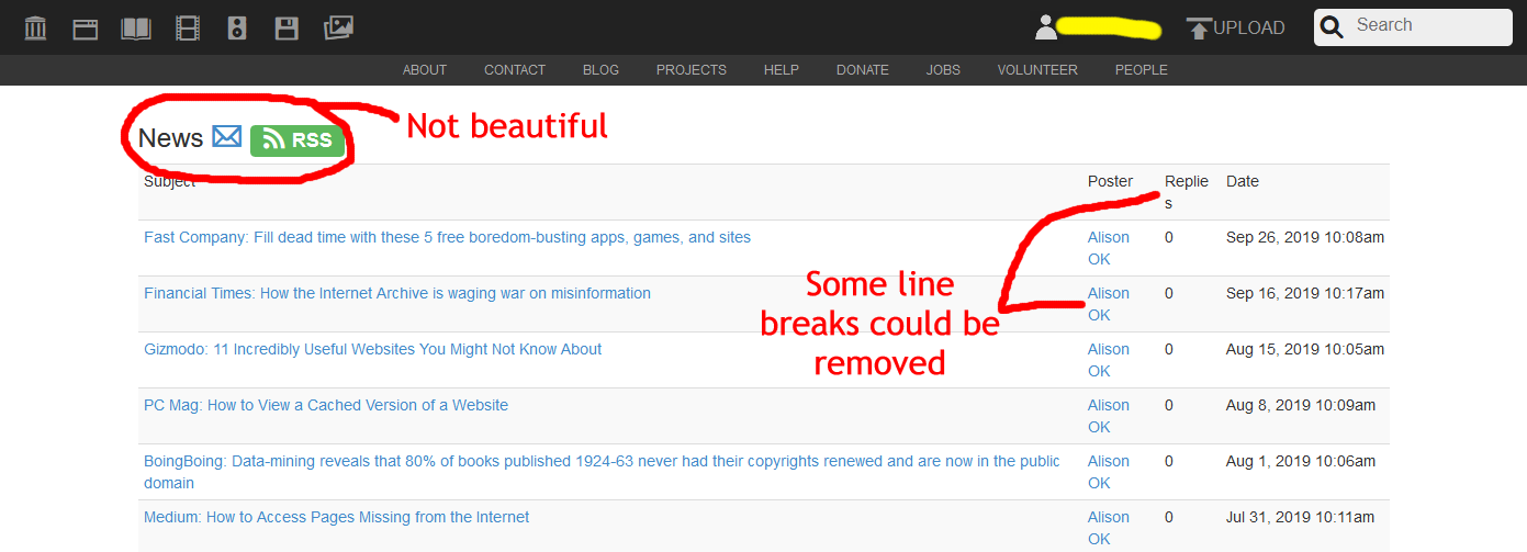
Forum: News
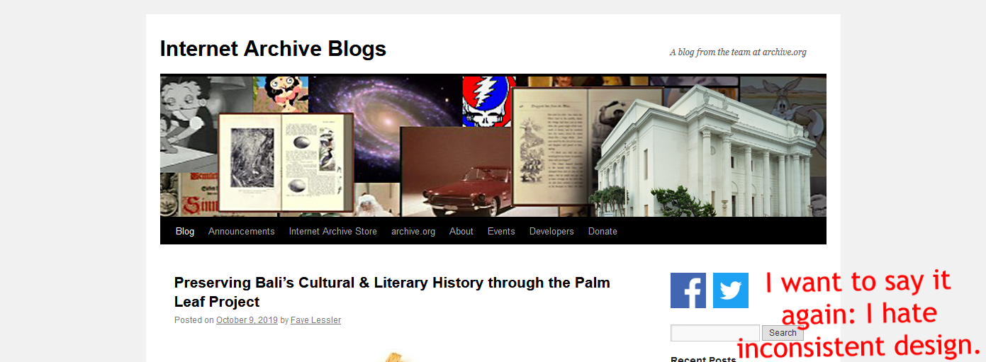
Blog
Dec 2021 notice: The blog of my personal website also looks very different in comparison to the other pages because it was too annoying to streamline the design...
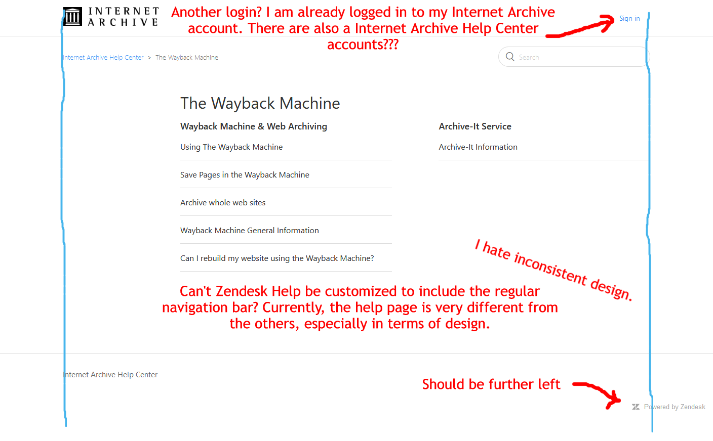
Help
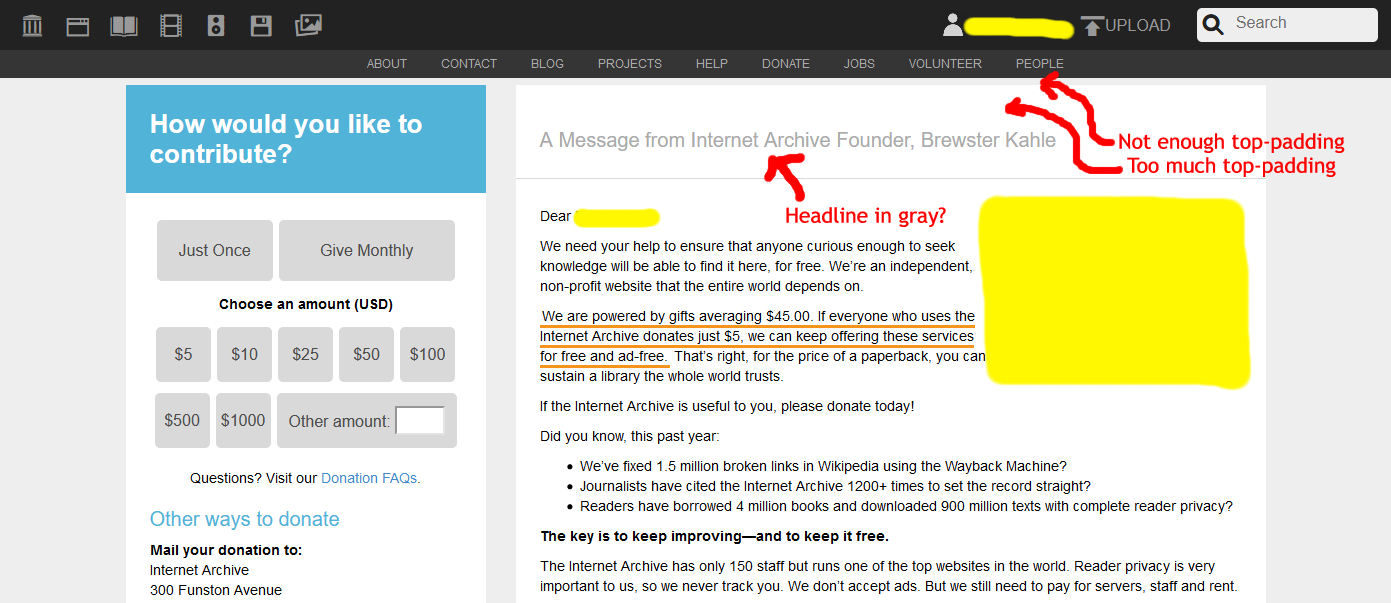
Donate
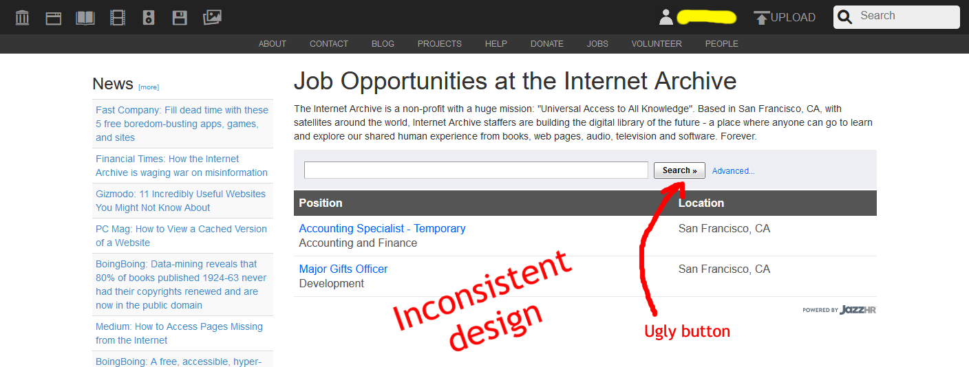
Jobs
Jobs: Major gifts officer

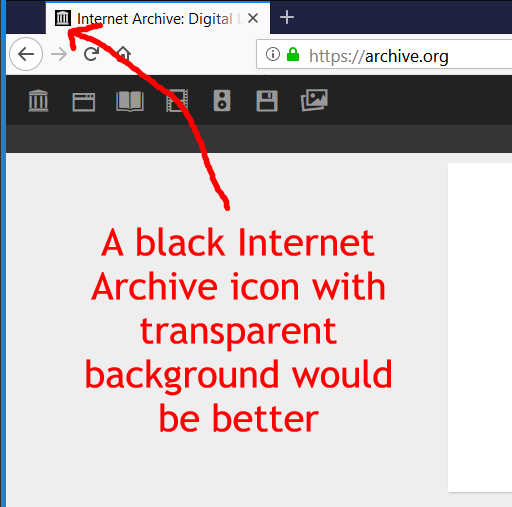
Favicon
I didn't mark spelling and grammar mistakes because I don't speak English very well by myself.
I only checked the desktop version. On the mobile version much more goes wrong.
Sorry for only mentioning negative things and for being petty, but that's the point of my project "Webdesign Criticism".